Remote.It Connection Redesign Concept
Redesigned connection and service application launch experience.
Overview
Background
I started this redesign after Remote.It was able to set up our products with Microsoft Clarity, a user behavior analytics tool that helps us understand how users are interacting with our web application. This allowed us to watch user recordings and get a sense of how people were using our products in their natural environment.
Our focus for this project was to better understand the experience of new users. After viewing a number of recordings, I noted the recurring usability issues they encountered and began to brainstorm potential design improvements.
Challenge
~29% of new users fail to complete the connection process. Our team was tasked to figure out why users were not able to complete the connection and to decrease this failure rate by 10%.
Goal
Simplify the connection workflow and improve the connection experience for new users in order to increase adoption.
My Role
My roles for this project:
User Research
Sketches
Visual Design
Design Process
Problem Definition
Identifying Key Usability Issues
The recordings of new user sessions allowed us to gain valuable insight of some of the common frustrations and confusions they were experiencing while using our application for the first time. Some of these pain points included:
Cluttered view of the connection information
Difficulty understanding the connection and launch process
Confusion when copying the correct connection information
User Flows
Visualizing the User Experience
I wanted users to be able to complete their goals with the fewest number of screens possible. One of the main goals as a new user is to be able to start a Remote.It connection to a service they’ve configured and launch it in the desired application.
I created a user flow diagram to map out the connection flow. This diagram helped me in planning the redesign, allowing me to better understand what the interface needed to provide the user for a positive experience.
Ideation
Sketches
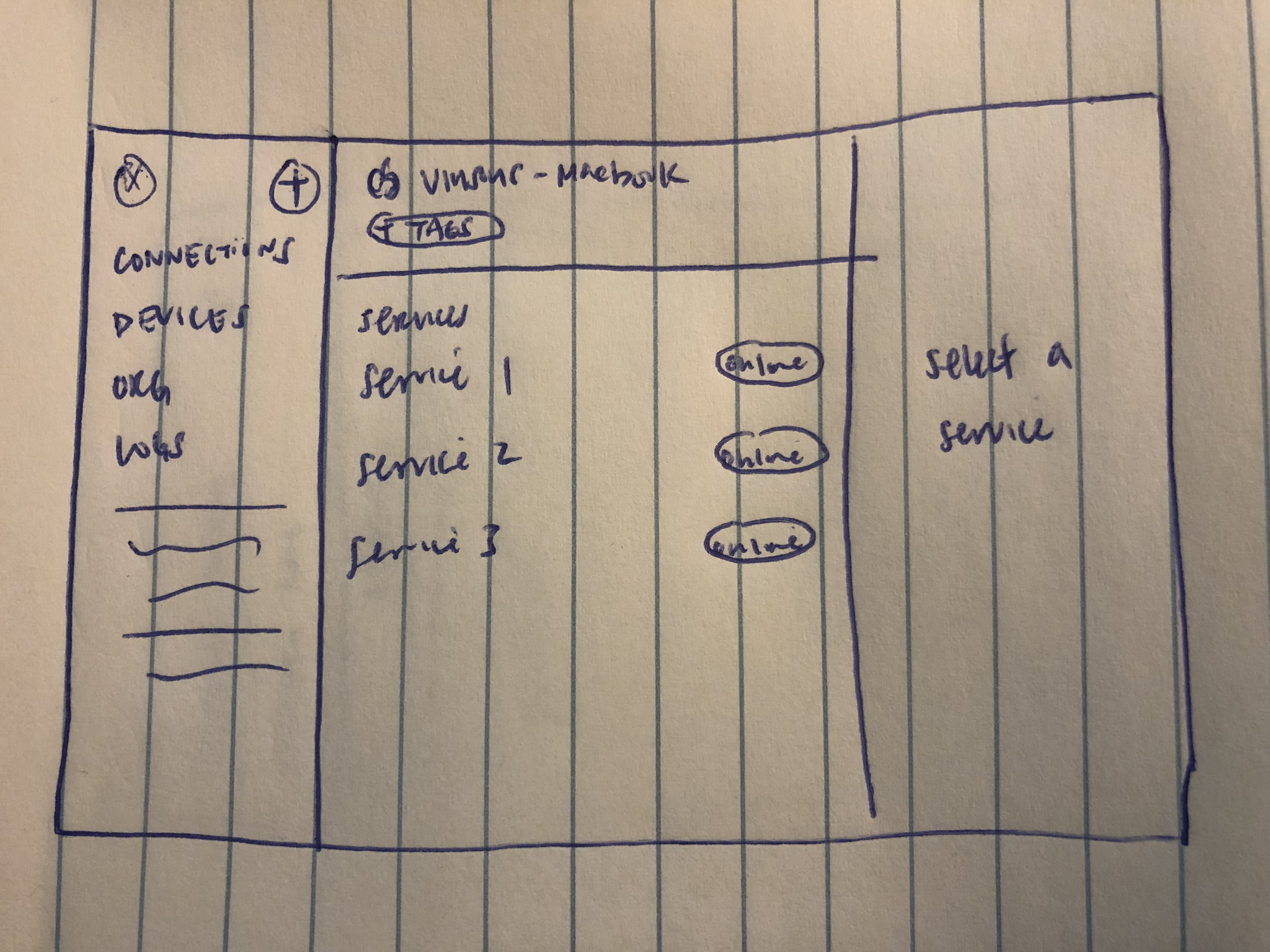
The following are initial ideas and sketches:


Mockups
High-Fidelity Designs
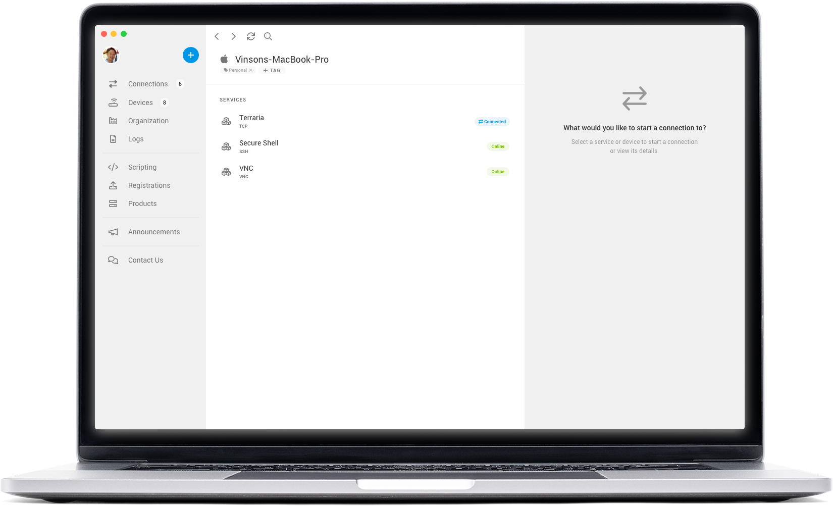
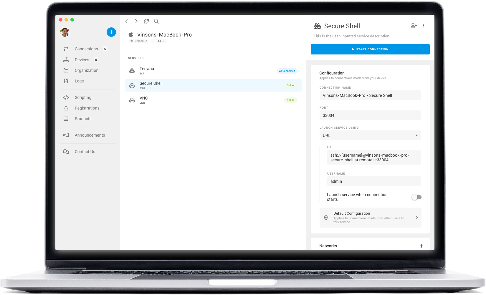
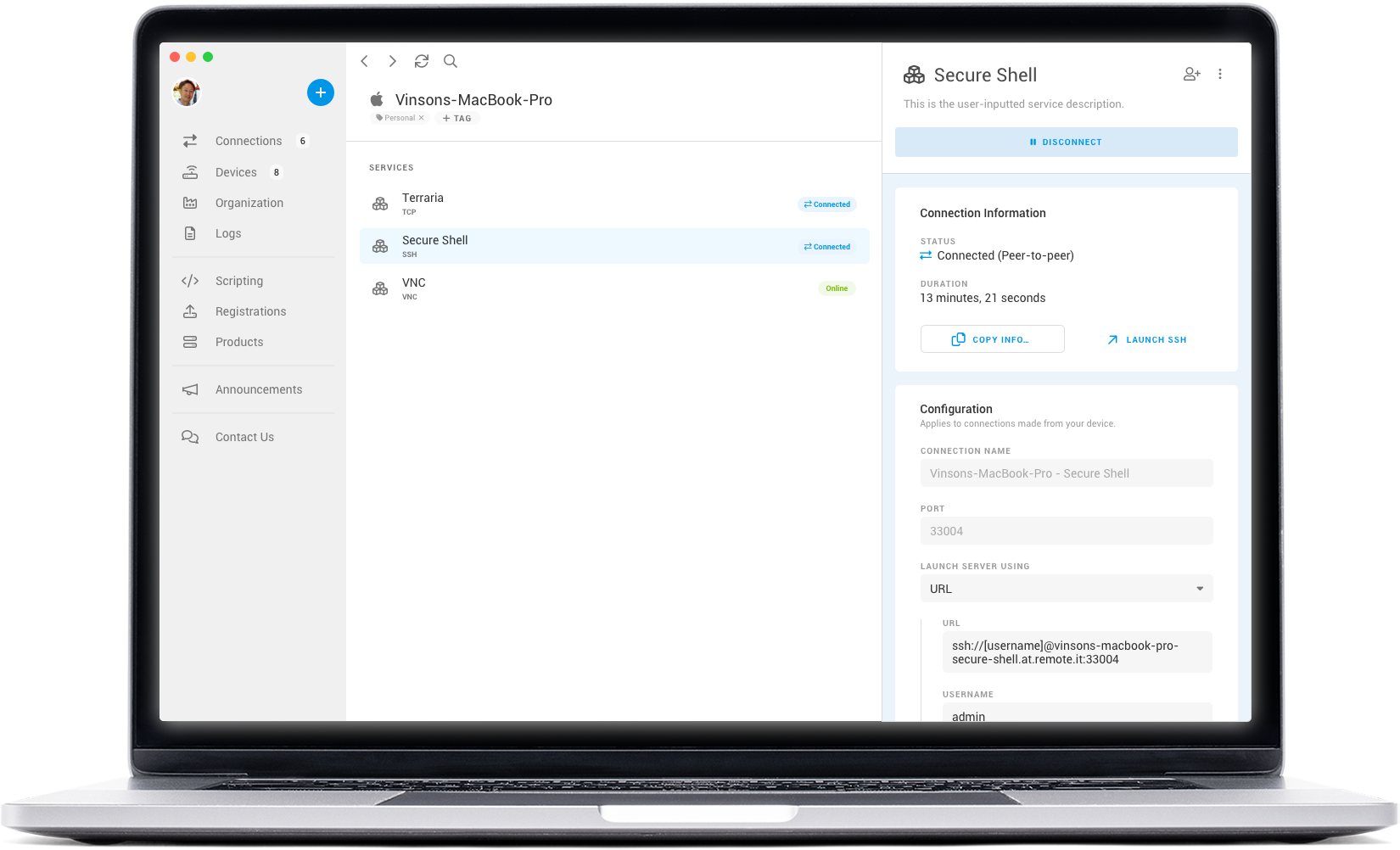
I used Sketch to create high-fidelity designs based on my initial sketches. I focused on solving the usability issues identified in the Clarity user recordings: visual clutter, inconsistencies, lack of information, and confusing buttons
Problem Focus
Visual Clutter
It was very common during a new user’s experience for them to not understand what to do and where to navigate once they select the device that hosts the service they want to connect to. The amount of information displayed to the users was overwhelming.
The first screen a user would see when selecting a service’s host device is the device information, which is counterintuitive when the main goal is to start a connection to a service. We see many users clicking through the various tabs of the device’s details page before they eventually find and select the service they intend to connect to.
To address this, I began by designing an empty state that prompts the user with what to do. This reduces the visual noise from the tabs and other extraneous information. The focus of the empty state is to instruct the user how to make a connection.
Once the user decides on a selection, the empty state is replaced with a redesigned connection interface that streamlines the connection flow. This is achieved by highlighting the Start Connection button as the main call-to-action and reducing the visual clutter by consolidating other options into a dropdown menu.
Default state prior to redesign
Redesigned default state
Redesigned connection interface
Problem Focus
Lack of Information
When the user starts a connection, the connection is still not complete. That is because they need to use the provided host/IP and port information to configure and launch the service application. The interface doesn’t provide any information on what the user still has to do before they achieve their goal.
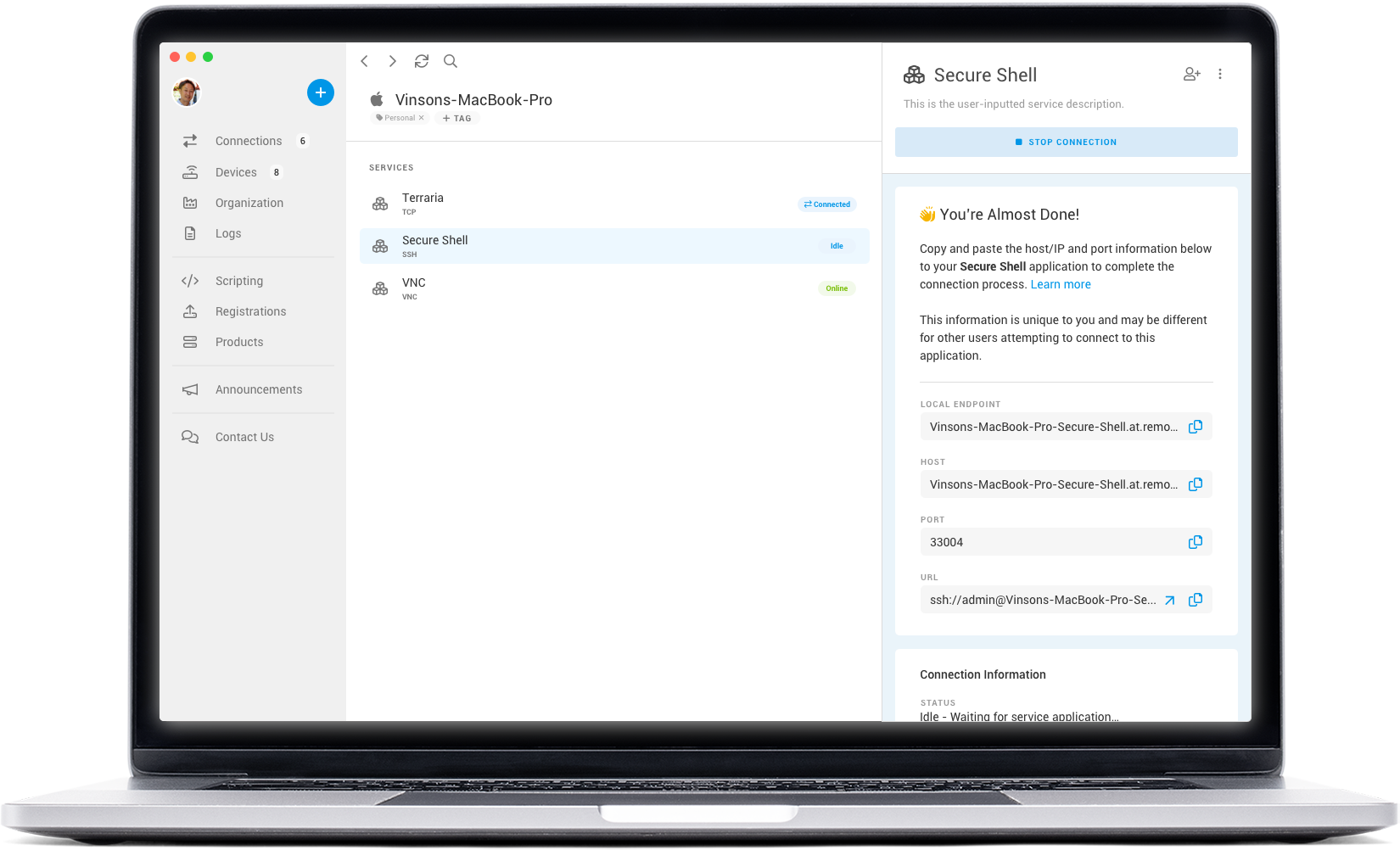
My solution for the gap in knowledge is to provide a prompt in the connection interface that is visible when the connection has started but the service application hasn’t launched. Included in the prompt are instructions on how to use the provided connection information to launch the service application.
Launch Instruction Prompt
Problem Focus
Confusing Buttons and Icons
Another common behavior observed during the recordings is the user repeatedly hovering over the different Copy action buttons prior to making a selection. Users were seen to select each of the copy buttons until they found the correct button that copied the correct connection information. This indicated to us that the icons failed to communicate meaning to the user and failed in helping them identify which copy action was appropriate. The interface seemed to have sacrificed usability for a more minimalistic design.
During a user interview with one of our customers, we were able to discuss the usability of these buttons. The user wanted to know what is being copied without needing to hunt for additional information from the on-hover effect. This inspired a design that shows each copyable string in a text field. Selecting the text field will automatically copy the associated string.
Connection Information Panel
Conclusion
Reflection
If I was given the opportunity to continue this exercise, I would like to validate the redesign by conducting A/B testing and seeing if it addresses the issues. Microsoft Clarity would allow me to see how the redesign is being used compared to the existing design and whether or not the changes were effective.
Another way to validate the redesign would be to view the metrics available in Tableau. I would track if there is an increase in connections that succeeded in launching a service compared to the overall amount of open connections.
What did I learn from this exercise?
From this exercise, I learned that I can leverage user recordings as another source of data to understand the user experience of our product. This method didn’t require us to wait for users to schedule a meeting or answer surveys. Instead, we were proactive about seeking out data. By watching the recordings and analyzing the data, I was able to identify usability issues that negatively impacted first time users and created redesigns to address them.


