Remote.It Global Search
Streamlined search experience for device management and support.
Overview
Background
Remote.It is a provider of Virtual Private Internet (VPI) services and allows users to easily create secure on-demand connections. This can be achieved by using the responsive web portal, desktop application, and native mobile app.
Goal
Our high-level goals were to:
Make it fast and easy for customers to access what they are searching for.
Help users understand why they are seeing the results that are being displayed.
Role
My roles for this project:
User Research
Sketches & Wireframes
Visual Design
Implementation Support
In addition, I worked closely with a product manager and 2 engineers (front-end and back-end).
Challenge
Customers weren’t happy with the usability of the in-app search feature. They complained that search results were confusing and did little to provide them with the information they were searching for. This made using our product tedious and slowed down their overall production.
Design Process
Research
Interviews
I facilitated one-on-one interviews with users from our current customer base. We started by asking them to recall the most recent time they used Remote.It and show us how they used the application. Our goal was to understand how they currently use the search feature.
4
users interviewed
175+
minutes of recorded data
3
different companies
Who We’re Designing For
Below are the users we are designing for:
Company Admins: These are the users that are in charge of setting up new devices for their organization and managing the user permissions for them. An example occupation this user would be is a DevOps Engineer.
Company Members: These are users that are given access to devices by the Admins. They are typically given access to a subset of an organization’s devices to complete their daily tasks. An example occupation this user would be is a Customer Support Engineer.
Problem Definition
Identifying Key Usability Issues
Based on the data, we identified the following usability issues:
No visual feedback indicating how the returned results match the search string. Users would have to do the guesswork to figure out why a device returned as one of the results, especially when the returned device didn’t match the search string.
Searching for a service (an application hosted by a device) is limited to the Devices page. This forced users to have to navigate back to the device page every time they needed to perform a new search.
Users get lost in a complicated user flow. If they aren’t familiar with the naming convention of the devices and services, they spend additional time in this loop of navigating back and forth between selecting a device and viewing search results.
Old user flow of searching for service to connect to.
Ideation
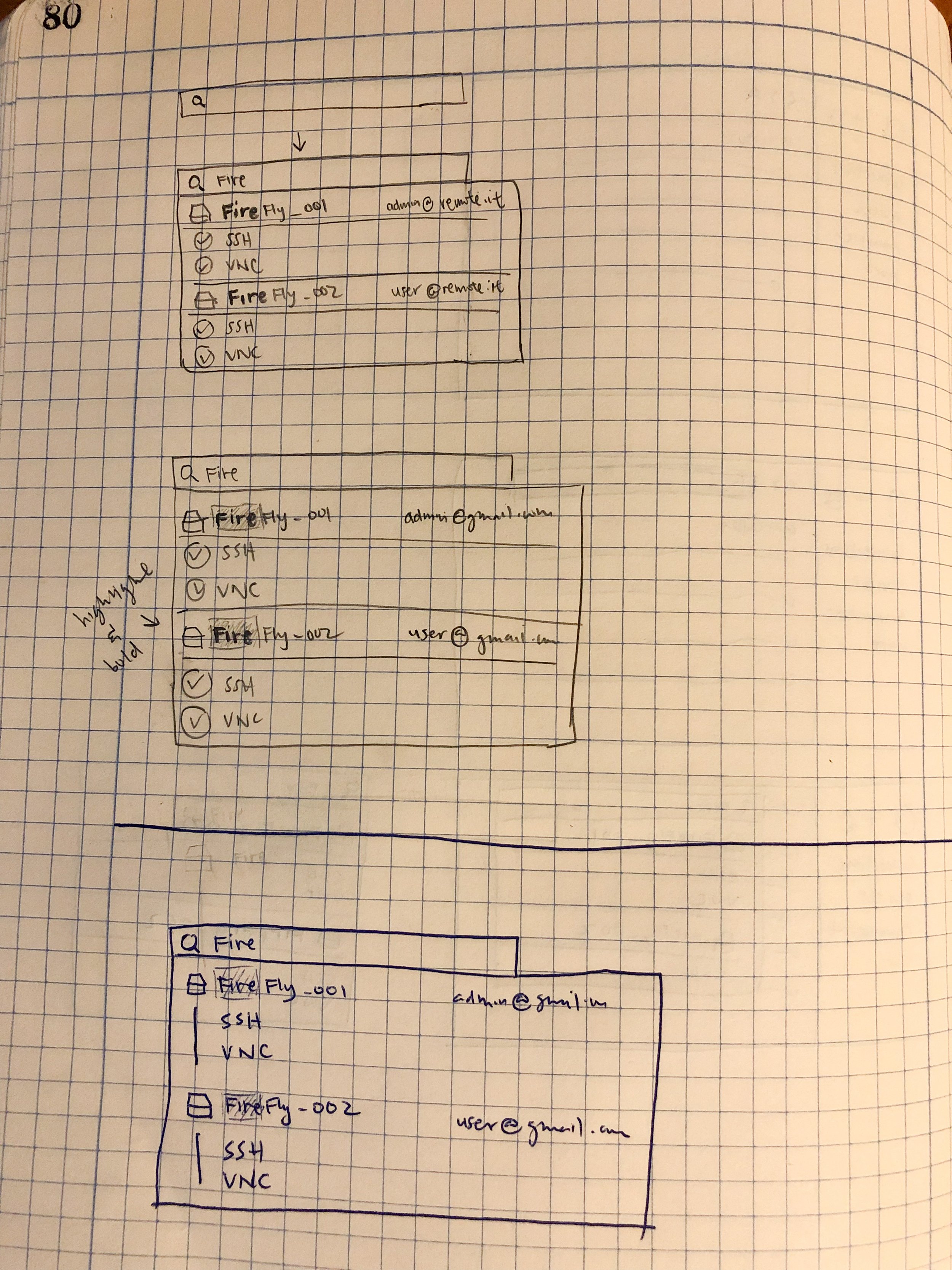
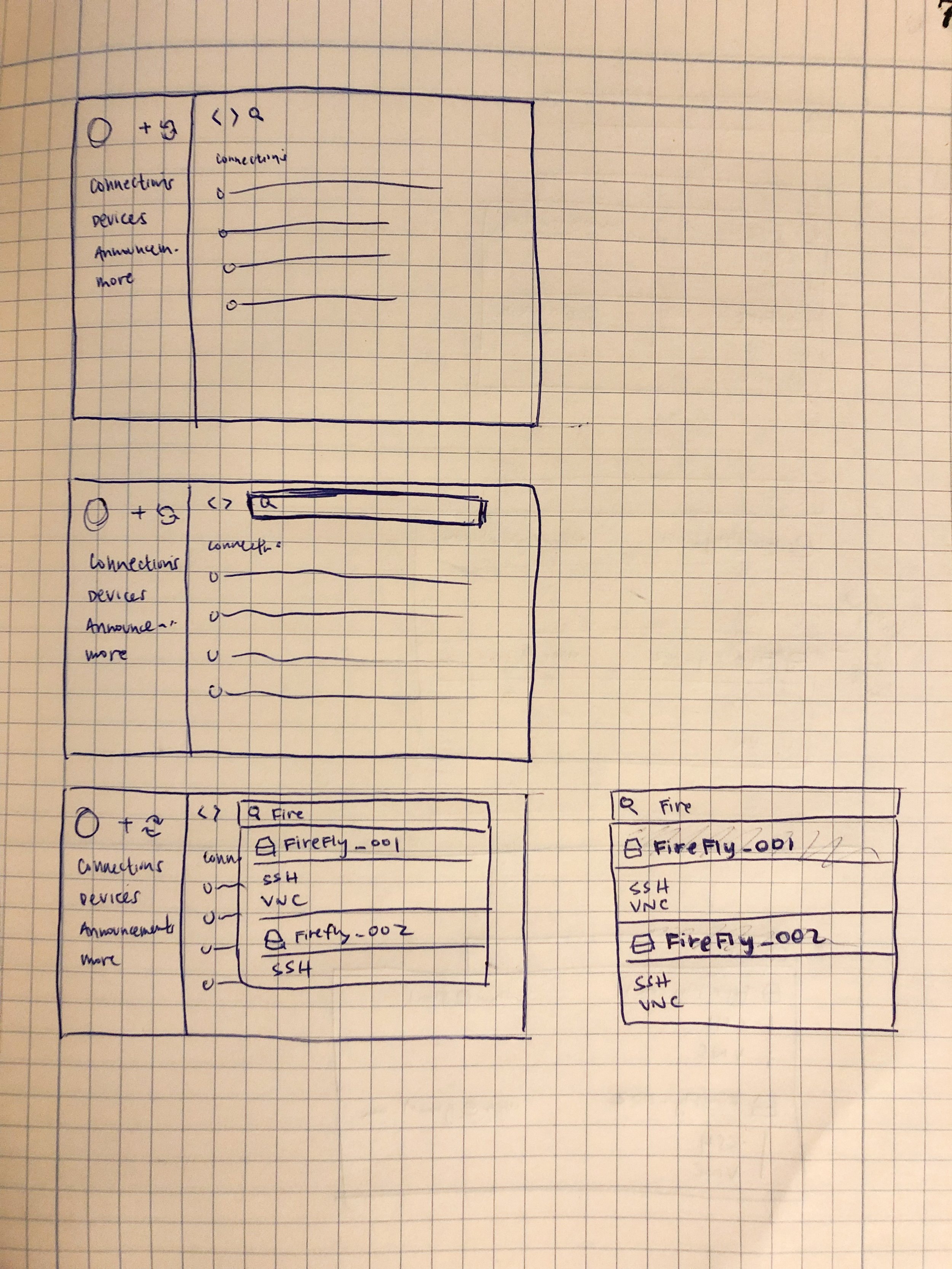
Sketches
After synthesizing the data and discussing the findings with the project team, I was able to generate the following goals for our designs:
Users should be able to view devices and services as part of the search results.
Users should be able to quickly see how returned results match the search string.
Users should be able to access the search feature regardless of their place in the application.
Here are some example sketches I drew to quickly iterate and generate discussion points with the rest of the team:
Mockups
High-Fidelity Designs
High-fidelity mockups were created once we were confident with the sketches. This helped to drive deeper discussions regarding the visual design and create a shared understanding with stakeholders.
Testing
Validating with Users
The general feedback from internal testing revealed that it was difficult to distinguish between the device names and its hosted services. We brainstormed ideas that would put more emphasis on visually distinguishing them:
Grouping services of a device by using a line.
Indenting the services of a device.
Showing the platform of the device.
Another interesting feedback we received was asked during one of the feedback sessions:
“If I can already see the service in the search results, why can’t I just connect to it from here?”
This feedback was something that seemed so obvious, yet we overlooked it as a possible improvement.
Conclusion
Solution
After a few more iterations and additional testing with internal and beta program users, we released the Global Search. Due to business reasons, we decided to release the Global Search without the Quick Connect feature.
Unfortunately, there were no analytics tools in place to measure behavioral metrics before or after the release. Our next best thing was soliciting user feedback from the customers that initiated the complaints as well as our beta program customers.
We’ve gotten positive feedback from these customers on how the search feature is providing much more value than before. The team has also reported that search-related complaints sent using customer Slack channels and Chat Support have significantly reduced.
“This change is so useful. I can easily find things now!”
Reflection
Although we saw a reduction in search-related complaints, the success of this feature could’ve been better measured if we had an analytics tool.
One metric we could use to measure is Time on Task. If we had this metric, we would be able to compare how long it took for users to search for a service to make a connection. A significant decrease in Time on Task to make a connection post-release would indicate a success.
Old User Flow
Before and After User Flow
New User Flow

